 Analysing existing graphic design work
The poster is promoting only the Tramlines festival held at The Bowery. The main focus of the poster is live music. The colours in the poster connote the build up towards the start of the festival, like a traffic light. The audience are students, young adults and music lovers. The 2 white bars along the title are to represent the tramlines in the city itself and to represent the event. Sans Serif Fonts have been used across the poster, as they appeal to the younger generation who use social network sites. The font also looks nice when it has to be compacted, to fit all of the information on the page. The festival is important to the City of Sheffield as there is an ideology that music is a big thing in Sheffield, and many great bands are from sheffield. Relative adverts are displayed around the poster to give people an idea of what will be on sale at the event, and also the business' will be able to promote themselves and set up deals with the event.
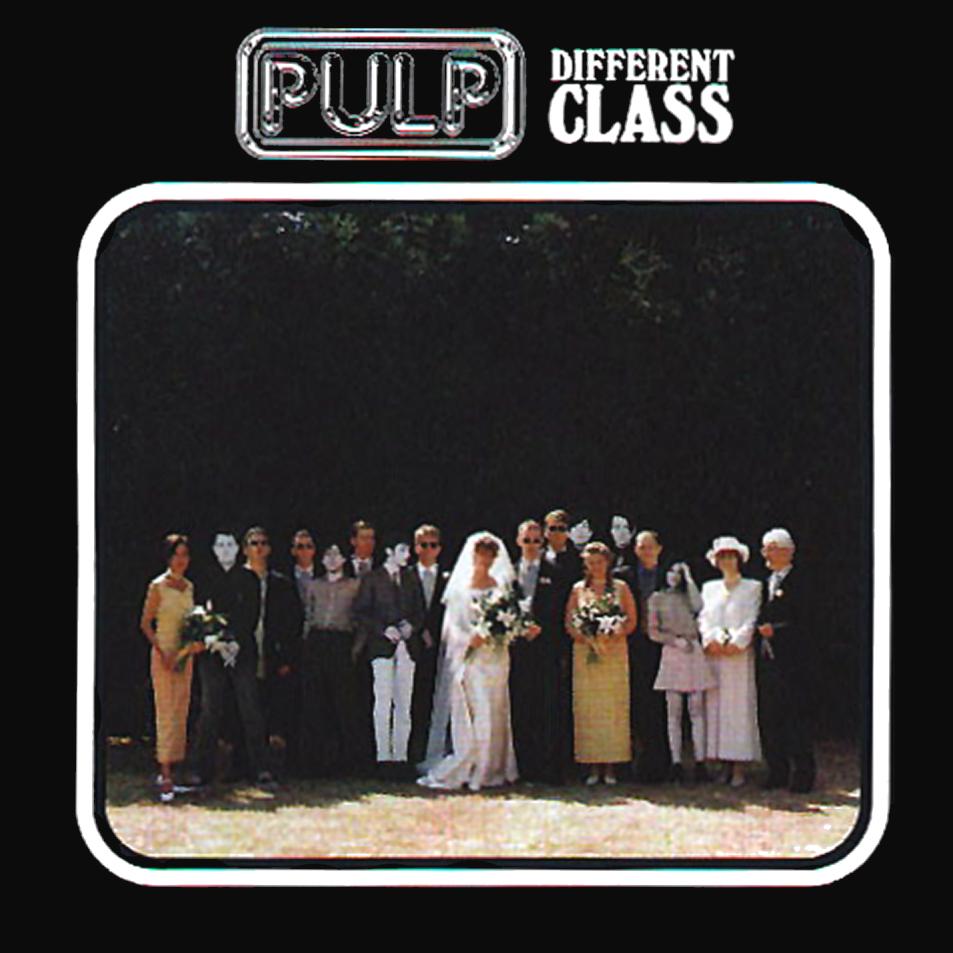
Pulp- Different Class
The Image uses a mix of Serif and Sans Serif fonts to give a feel of contrast to the album cover, as it connotes a demonstration between the different classes of people. The people in the photo are wearing many different things, some are casual, some are smart. This gives yet another feel of different class, which gives purpose to the title of the album. The look of the album cover is very simple and minimalist, yet has many small details which display the meaning of the albums title, which connotes the album was made for the more sophisticated person who is able to spot the small, key details which others may not.

No comments:
Post a Comment