Body Copy- Refers to the text of your written articles, which should produced as a printed presentation to accepted industry standards industry standards e.g. correct use of language, font size, word limits etc. Usually written in columns.
Serif Font- Fonts like Times New Roman, or Baskerville Old Face, which have little bars (serifs) on the end of the letters.
Sans Serif Font- Fonts like Impact or Agency FB, which do not have little bars on the end of the letters.
Drop Capitals- Really big letter, that start off an article
Cross Head- Small sub-heading used to split up a large box of text
White Space- White parts of a page with no images or text
Mode of address- How the text talks to the audience
Sell lines/Slogans- Smaller strap lines that sell something to the audience
Banners- Text, which stands out because it's on a coloured background
House style- The style of a magazine which allows it to be different to others
Denotation- The literal or primary meaning of a word, or image in contrast to the feelings or ideas that the word suggests.
Connotation- An idea or feeling that a word or image invokes for a person in addition to its literal or primary meaning.
Thursday, 26 September 2013

Wednesday, 25 September 2013
Copyright Law
"Copyright is a legal concept, enacted by most governments, giving the creator of an original work exclusive rights to it, usually for a limited time".
This means that it is illegal to use or copy work that has been copyrighted without the creator's/licence holder's permission.
Games and TV shows are often downloaded and/or streamed on to computers. Sites like www.thepiratebay.com and www.sockshare.com are 2 sites that both stream and have downloadable content on them.
Creative Commons is a website that plays host to lots of types of creative media. The website negates the effect of copyright as everything on the site has no copyright laws and is designed for the general public to use. Creative Commons allows designers to share their ideas with other people around the world. www.creativecommons.org
I have to consider copyright when I do my graphic design project, all the different copyright laws, especially if I use anything I find on the internet. I must create all the designs I use on photoshop or illustrator etc. as nothing should be taken and it should all be my own work.
This means that it is illegal to use or copy work that has been copyrighted without the creator's/licence holder's permission.
Games and TV shows are often downloaded and/or streamed on to computers. Sites like www.thepiratebay.com and www.sockshare.com are 2 sites that both stream and have downloadable content on them.
Creative Commons is a website that plays host to lots of types of creative media. The website negates the effect of copyright as everything on the site has no copyright laws and is designed for the general public to use. Creative Commons allows designers to share their ideas with other people around the world. www.creativecommons.org
I have to consider copyright when I do my graphic design project, all the different copyright laws, especially if I use anything I find on the internet. I must create all the designs I use on photoshop or illustrator etc. as nothing should be taken and it should all be my own work.
Starter Revision
1. A logo design should be simple, memorable, replicable and eye catching
2. The headline act should be at the top of the poster so attention is drawn to it
3. The 2 good analysis words are Connotation and Convention
A visualisation diagram has to have use of colour, actual text that will be on there.
They are important to show a client so they can change them and decide on how they want them.
2. The headline act should be at the top of the poster so attention is drawn to it
3. The 2 good analysis words are Connotation and Convention
A visualisation diagram has to have use of colour, actual text that will be on there.
They are important to show a client so they can change them and decide on how they want them.
Friday, 20 September 2013

Task 2: Creative Design
1. John Hartley (1987) suggested that media producers create 'invisible fictions' of their target audiences which they invent themselves
2. Ien Ang (1991) similarly argued that all media producers create 'imaginaries entities' of their target audiences before creating a media product
2. Ien Ang (1991) similarly argued that all media producers create 'imaginaries entities' of their target audiences before creating a media product
Thursday, 19 September 2013
LO1 Related design Pieces

 Format- There is a Tee shirt, a logo and a flyer. The tee shirt will appeal to people as it will make them feel part of the festival, however they will be advertising the festival by wearing the tee. The flyer gives all the information needed by the people going and the logo will appeal to the target audience due to its stylistic approach and simplicity.
 Content- The tee has no brand recognition with the other pieces but its good design will appeal to people going as well as help sell it to others. The flyer has information about the acts and the dates as well as social media information to help people associate with the festival. The Tramlines logo has the logo, name and tag line on it, and is only a small piece, which will allow them to put the logo on most things.
Style- The style of all 3 is very modern, all sharing a similar colour scheme, utilising black and white as well as reds in some pieces. The font is sans serif which gives it a modern feel and look.
Layout- The layout of the tee is fairly standard for a tee, just having an image on the front. The tramlines flyer is a good, spaced out layout, with a fair amount of information.
Target Audience- The target audience for tramlines is students and young adults, so the modernistic approach and fun colour scheme will appeal to the audience.
Regulatory Bodies- There are no copyright infringements due to the fact that all the graphics used are designed for the purpose, the bands playing will have given permission to be used on the flyer to advertise themselves, and there are no expletives on any piece.
 Purpose- The purpose of the pieces is to sell the festival to people and make people aware of the event.
Format- The tee shirt is a simple design with the information of the event at the front. The logo is very standard and eye catching, clearly stating the events name. The poster is of a standard poster format with information as well as a huge array of the acts to tempt people to go to see their favourites.
 Content- The tee shirt has a small amount of information on it but shows clearly where the tee is from, so others will know. The logo is very simple, with only 2 chevrons as graphics and the name, it's simplicity makes it easily recognisable. The flyer has a good number of sponsors and contact info. It also has many bands and date information so people can intake all info from one place.
Style- The style of the poster and logo are very similar to create brand recognition, they use the exact same colour scheme and similar fonts throughout to show the similarities. The tee is a varsity inspired one, like from a college or university, which will appeal to their student and young person target audience.
Layout- The logo is laid out simply, in a fashion that is easy to read. The poster boasts the same style and layout of many other previous festival posters so that people know it is a festival when they look at it. The font on the tee is laid out like a sports banner from a college or university to link in with the style of tee it is on.
 Target audience. The simplistic, colourful and modern font in the logo will help appeal to the young adult audience it is trying to reach, so the colour scheme used on the poster will also work. The tee will work well with the audience due to it being a university inspired tee shirt, so many young adults may appreciate its style.
Regulatory Bodies- There are no copyright infringements due to the fact that all the graphics used are designed for the purpose, the bands playing will have given permission to be used on the flyer to advertise themselves, and there are no expletives on any piece.

Format- The poster is of a fun format, with lots of bright, appealing colours for people to view. The article is formatted like a normal article, as there are small paragraphs of a group or artsit, alongside their picture. The logo is also formatted well, with modern, sans serif fonts and only 3 colours.
Content- The poster has little content, yet manages to get all the necessary information on it, only consisting of a few bands, dates and acts. The logo has the name of the festival as well as the associated partner on it, the simplicity works well. The magazine article has a few of the rising stars and main acts to help the reader discover what the festival has to offer.
 Style- The style of the poster is not one similar to most festivals, with a large section devoted to a picture of the acts, and only a small one for the list of acts. This is because the people going are only going for one genre of music, and more than likely know what to expect at the festival, in terms of music. The style of the article is fun yet informative. Small paragraphs with bright pictures allow the reader to spend a small burst of time immersing themselves in the text, meaning if they are interested, they are likely to look up the act they read about. The logo is a modern and contemporary style, which gives it the smooth, serene feel associated with jazz music.
Layout-The poster is not laid out like a usual festival one, this is because it is a much more specialised festival than most others, so the acts do not need to be displayed in as much depth, as the genre of music is consistent throughout. The article is laid out like a normal informative article usually is, with a small amount of text accompanied by pictures.
 Target Audience- The target audience is people who like jazz music, regardless of age. Whereas many festivals today are infamous for drugs and alcohol, this one is more mature and appeals to a much more expansive age range, and as there are few jazz festivals around, it will appeal to all jazz lovers nationwide, possibly even globally. The few acts displayed on the poster is because the target audience will enjoy jazz music, so are not just going for a specific act, so only headline acts are needed. The soft purple in the logo is also associated with Jazz, so will be appealing to the target audience.
 LO1 KTA 4: ASA and Copyright Information
Advertising Standards Authority- is a non statutory body but provides a code of practice for the authority.
 Nicklas Bendtner pulled down his shorts slightly to show his Paddy Power boxers to advertise the brand after scoring for Denmark against Portugal. He was fined due to breaching advertising laws by passing off a marketing communication, as it was classed as ambush marketing.
Dior used Natalie Portman in an advert about mascara even though her eyelashes were enhanced in the advert afterwards. Dior argued it was because she wasn't originally intended for the advert but it was false advertising and was banned later.

Phones 4 U used an advert that included a scary looking girl from a horror film following round a woman, saying missing our deals will haunt you. This was put on before the watershed and was considered harmful to children.
Slam Dunk Festival
 The Slam Dunk Festival advert in the Kerrang magazine displays a woman laying down on stage with a low cut top on, as well as groups of people with alcoholic beverages. This could be considered offensive as it may objectify women and tell the reader many women at the event may be under the influence of alcohol. This is also glorifying sexual activity and alcohol and also objectifying the women at the festival.
- Adverts should not cause offence
- Adverts should not glorify alcohol, sexual activity or drug taking
- Adverts should not cause harm to children
- Adverts should not be misleading
- Adverts should not give false information about the products or thing they are selling
The ASA are a company that regulates advertisements in media. They apply the advertising code set by the Committee of Advertising Practice they work with complaints made with the public
 Nicklas Bendtner pulled down his shorts slightly to show his Paddy Power boxers to advertise the brand after scoring for Denmark against Portugal. He was fined due to breaching advertising laws by passing off a marketing communication, as it was classed as ambush marketing.
Dior used Natalie Portman in an advert about mascara even though her eyelashes were enhanced in the advert afterwards. Dior argued it was because she wasn't originally intended for the advert but it was false advertising and was banned later.

Phones 4 U used an advert that included a scary looking girl from a horror film following round a woman, saying missing our deals will haunt you. This was put on before the watershed and was considered harmful to children.
Slam Dunk Festival
 The Slam Dunk Festival advert in the Kerrang magazine displays a woman laying down on stage with a low cut top on, as well as groups of people with alcoholic beverages. This could be considered offensive as it may objectify women and tell the reader many women at the event may be under the influence of alcohol. This is also glorifying sexual activity and alcohol and also objectifying the women at the festival.
LO1 KTA 3/5: 5 Pieces of Graphic Design

 Download is a music festival designed to entertain with a huge line up of bands. The target audience of the event is for people between the ages of 18-40 mainly. The format of the piece is a poster with many bands in a block list under the days the band will be playing. The style is to do with the type of bands that play there as it has a dark background and a dog surrounded by fire. Which relates heavily to the music that it advertises. Much of the poster is created with dark colours and reds, this creates the impression of the dark music that will be played at the festival. There are many 'satanic' images around the page which keeps with the rock music theme. Much of the poster is designed in a tattoo style which links in with the rock music theme as people who enjoy rock music often have tattoo's and body art. The layout of the poster, although informal does have structure with the bands under the dates they are playing as well as the stages they will be playing on. The event is sponsored by music channels like kerrang which play the music of the bands that will be at the festival.


 The tramlines festival is a music festival in Sheffield designed to entertain. The target audience of the event is all ages as there are many different acts, bands and varieties of entertainment. The content in the logo is very minimalist. There is a lot of white space around the text which draws attention to the central images. The logo text is in a serif font as it is a more modern font than a sans serif so it connotes a change in times as it is the 5th tramlines festival and it shows the Sheffield music scene is evolving. The main 'T' logo is quite abstract and is very modern, which appeals to the student side of Sheffield for the universities within the city. The logo itself can also be used as a banner which is very clever as it means the logo can be used in many different ways. The tagline 'Inner City Music' is also very good, as it is a short, catchy and memorable slogan, which will be easy to read quickly so it can be put on billboards and other sorts of advertising purposes. The festival is sponsored by Nokia which connotes new technologies, interacting and socialising which is what the festival is about. It is also sponsored by lots of relevant things from the city like the trams which could do deals for transport around the stages in the city. The logo uses only 3 colours which makes the logo very simple and eye catching which is another reason that makes the logo great.

 The iTunes festival is a music festival that takes place for 30 days in September. The event takes place at the roundhouse art centre in London. The event played host to 62 bands over the course of the month. The billboard is very minimalist and gives very little detail to the viewer as to what bands are on, and to the dates. This connotes that Apple as a company want the viewer to go on the site to find out what is on at the event and get sucked into their business ideas and therefore Apple will be able to use their selling skills to draw in the viewer and sell the product to them. The Poster uses very few colours and draws attention to the middle of the poster. All fonts used are sans serif as iTunes and Apple are very modern business' and like to be the future of design and progress. The poster looks as though it has been painted onto a graffiti background which connotes it is not corporate and will be seen as cool to the target audience of people between 16-40. The modern looking paintbox/graffiti stencil shows that the festival is very modern and creative and isn't just the normal 'hippie' festival.

 The Slam Dunk festival is a punk rock festival hosted by Slam Dunk records. The festival is aimed at people ages between 18-30. The festival is hosted at Leeds university. The host location is at Leeds university. This was a great choice for location as most of the target audience are in the age bracket of being university students. The punk movement was all about rebellion and disobeying the rules, so by putting all the images in the article dotted and distorted around the page connotes the way punk music is not orderly and is not set in it's ways and is susceptible and wants change in the times. I have taken 3 images of different advertisements of the event, one is the website, the other is an article in a magazine. These both demonstrate similarities between branding, which means the festival will become more and more recognised due to the fact that every piece of the advertisement is consistent. The stages are sponsored by relevant companies. The sponsor of one of the stages is Atticus. Atticus is a brand that makes punk style clothing and footwear, so the people who attend this festival are likely to purchase the clothes that Atticus have to offer. The fonts used are all Sans Serif fonts and are all modern looking to promote the change that punk rock wants and what it stands for. The modern fonts will also appeal to the audience as they are young people who will prefer these fonts to the more standard and traditional serif fonts like Times New Roman.

 The Birmingham International Jazz and Blues festival is a music event that lasts from the 5th July to the 14th July. The target audience is a more sophisticated age range, around 18-60 which is shown in the simplicity of the logo. The music consists mainly of Jazz and Blues but also has a few more showcases around. Birmingham was chosen for a location as many of the biggest blues and jazz artists in England came from Birmingham as it is a very culturally diverse city. The font used is Sans Serif for the logo, this was a good choice as it shows that although the style of music dates back to the slavery era, the music is able to move forward with the generation. The logo is simple with only 2 colours. Both are associated with the music they play. Blue connotes sadness and depression which is where blues gets its inspiration from. The silver is linked with jazz music as the colour symbolises the metal roots background where jazz music was made, like the steel drums which were first used back in the carribbean islands.
 Wednesday, 18 September 2013
LO1 KTA 2: Analysing Conventions of Graphic Design Products
 Analysing existing graphic design work
The poster is promoting only the Tramlines festival held at The Bowery. The main focus of the poster is live music. The colours in the poster connote the build up towards the start of the festival, like a traffic light. The audience are students, young adults and music lovers. The 2 white bars along the title are to represent the tramlines in the city itself and to represent the event. Sans Serif Fonts have been used across the poster, as they appeal to the younger generation who use social network sites. The font also looks nice when it has to be compacted, to fit all of the information on the page. The festival is important to the City of Sheffield as there is an ideology that music is a big thing in Sheffield, and many great bands are from sheffield. Relative adverts are displayed around the poster to give people an idea of what will be on sale at the event, and also the business' will be able to promote themselves and set up deals with the event.
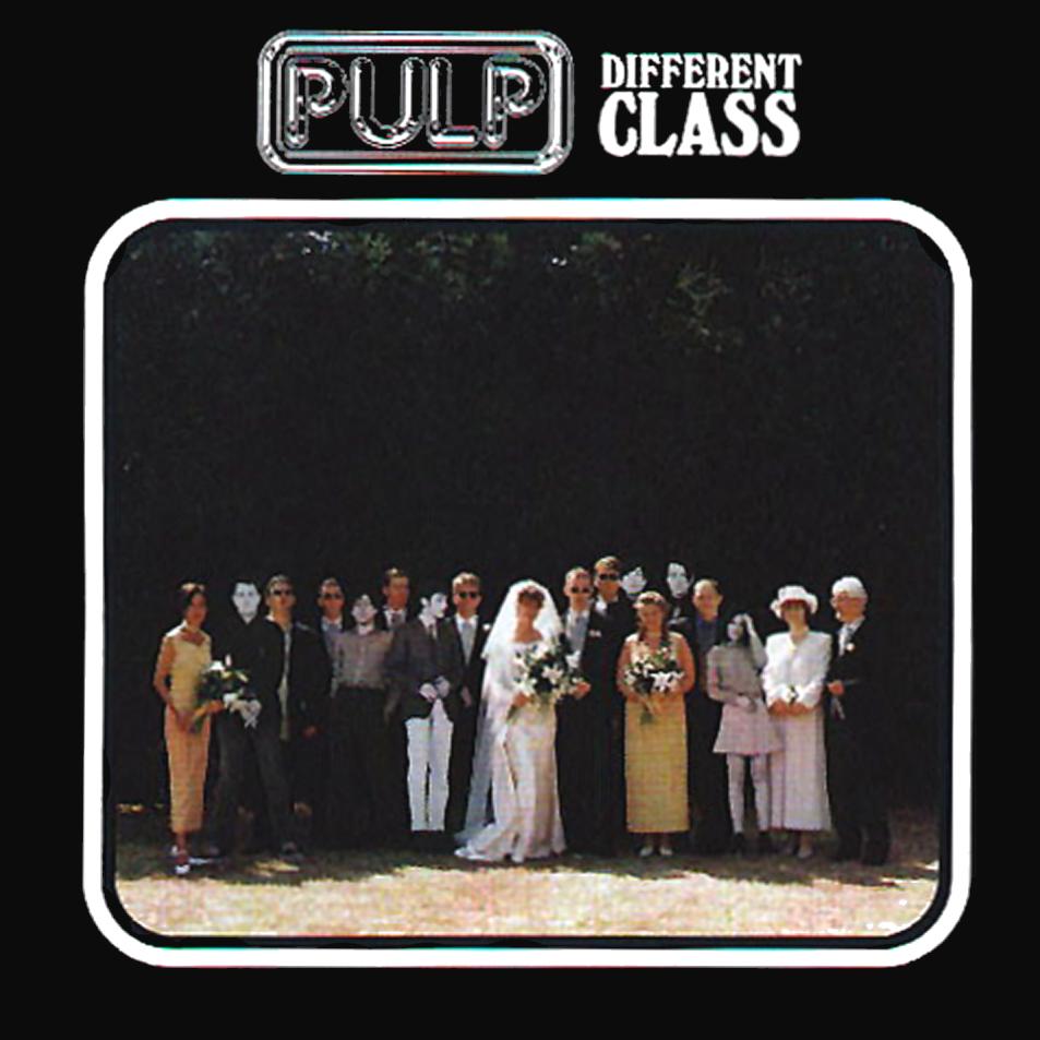
Pulp- Different Class
The Image uses a mix of Serif and Sans Serif fonts to give a feel of contrast to the album cover, as it connotes a demonstration between the different classes of people. The people in the photo are wearing many different things, some are casual, some are smart. This gives yet another feel of different class, which gives purpose to the title of the album. The look of the album cover is very simple and minimalist, yet has many small details which display the meaning of the albums title, which connotes the album was made for the more sophisticated person who is able to spot the small, key details which others may not.
Tuesday, 17 September 2013
LO1 KTA 1: Write up of industry professional notes
 Nick Bax- Human Studios
Nick Bax created a website called humanstudio.com, which started off making films and animations. He worked for a company called Designers Republic which was a graphic design workplace. After that, he worked on projects with many different bands as well as developing applications for smartphones. The Human Studio company has worked on many projects, one of the recent projects was branding for a new fashion company called Fitriani, which had to be done without even seeing the clothes first. This first project was completed in around 3 months. The company does lots of media work for the University of Sheffield, not only designing the prospectus but also currently on the Universities website. This is lots of animation and videos to make the website more interesting and interactive. The company made a digital catalogue to play host to their work, this is like an online exhibition to attract business to their site, this was called "The Art of Sci Tec). The company has also made a 3D gallery called "Computer Love" displaying many pieces of artwork, many features on the gallery are interactive to try and make the viewer feel like they are in the area. There are also sound effects to give the viewer depth perception. They are currently undergoing a project for the 2014 World Cup in Brazil, this would be in Sao Paolo, it would play host to many virtual banners and many other football related pieces.

Nigel Stafford- Clear Channel
Nigel Stafford is a graphic designer and Freelance photographer. He is a graphic designer and photographer for Clear Channel UK. Clear Channel UK is an outdoor advertising company which has more than 70,000 advertising locations across the UK. It has 4 main brands in Clear Channel Billboards, Clear Channel Adshel, Clear Channel Pinnacle and Taxi Media.The Billboards from Clear Channel are in 2 sizes, 48 sheet and 96 sheet billboards.
 This is a the logo of Nigel Staffords Music Studio, called gadget boy productions. He designed the logo himself. The logo is very good as it is simple, using only one colour for the background and the other for text. The text is in sans serif, which is a very modern style and gives a youthful feel to show the brand is ready to go forward. Also it is clever as the G and P look like earphones, this is a clever feature as it is a music production company.
LO1 KTA 1: Industry Research
Nigel Stafford is a graphic designer and a free lance photographer. He is a graphic designer and photographer for Clear Channel advertising. He produces music for his own company under the name Gadgetboy Studios. He also DJ's at the coorporation as well as freelancing. Companies must give a clear description of the design they want for the designer to adhere to it.
Tips for graphic design
Tips for graphic design
- Make tickets to an event memorable. Maybe with a good design or picture. This could be a good way to advertise the event to people for the next year as many people keep them as souveniers.
- The front of the flyer must be must be interesting and eye catching so people want to read the back. The back should be much more detailed with lots of information on it so people can get the information for the event.
- When designing a logo, make sure it is simple. Simple logo's are the best as they are easy to remember, few colours need to be used. A smart, intellegent logo is also a good idea as it sells the business and gives an idea of the capabilites of the company.
- Make sure the poster is aimed at the age group or gender that you need to aim for

Monday, 16 September 2013

Subscribe to:
Posts (Atom)